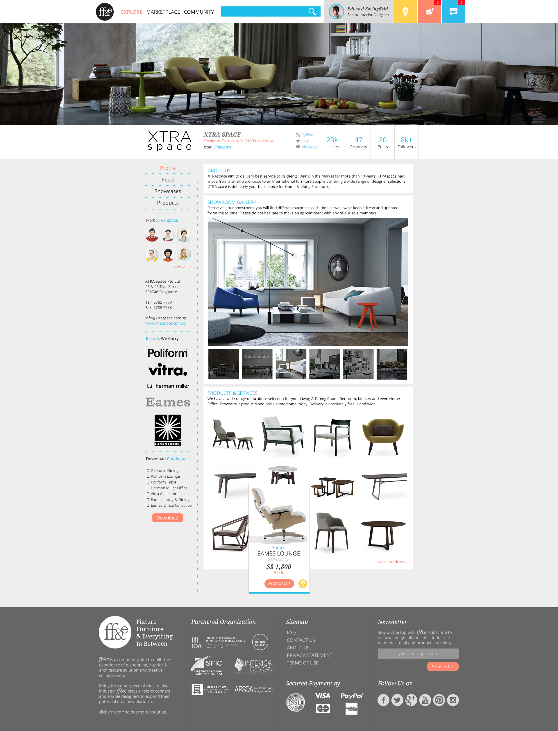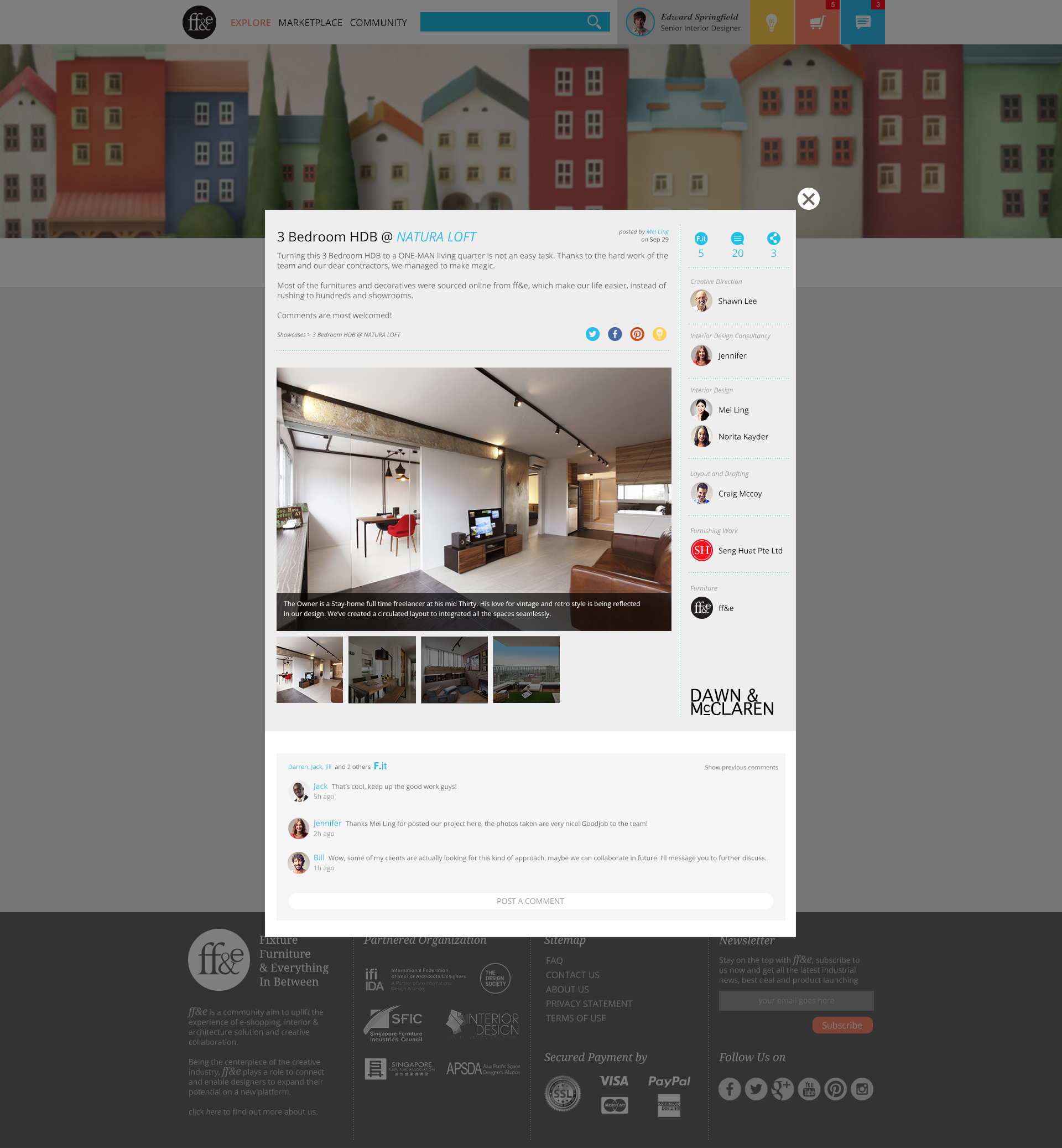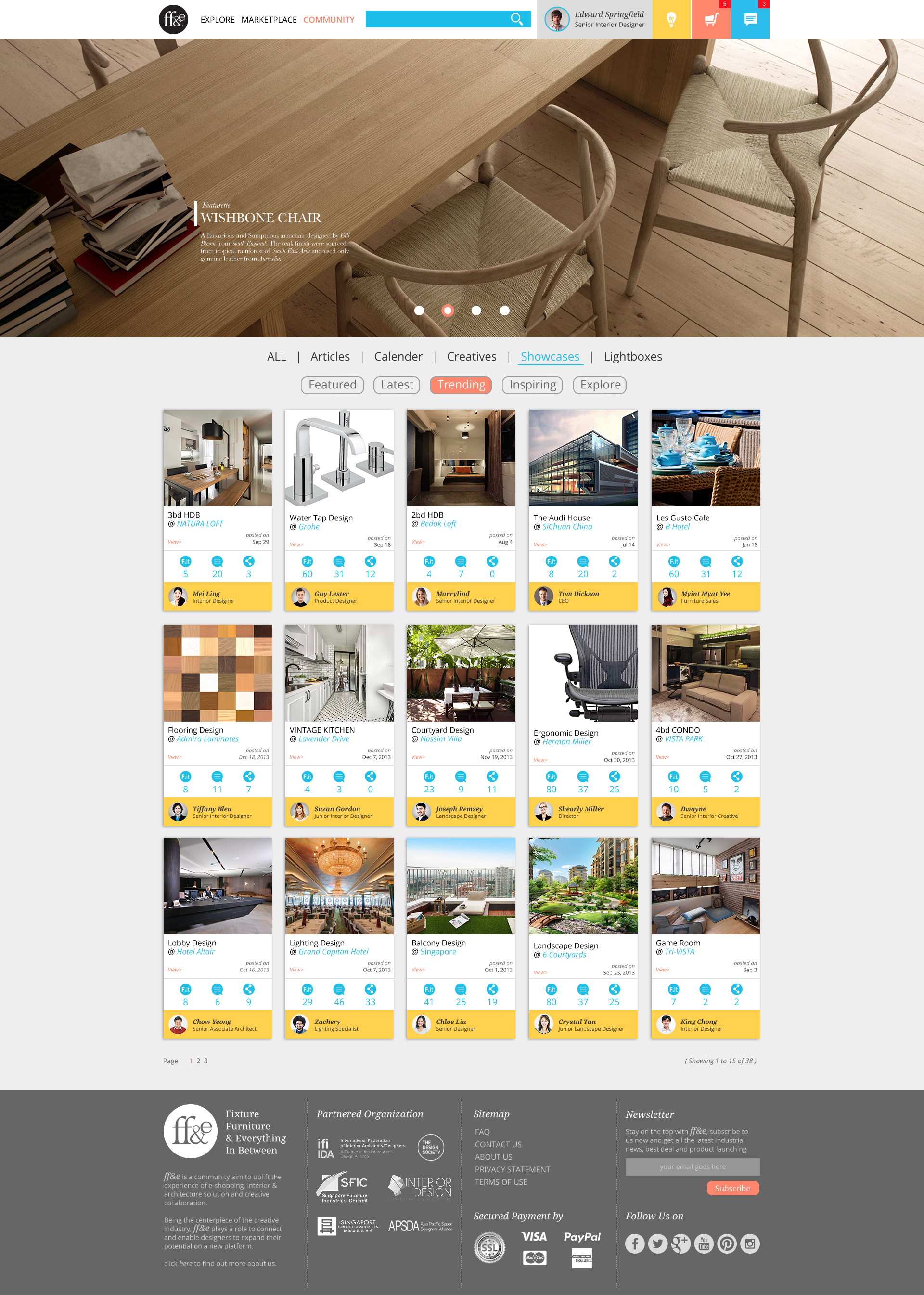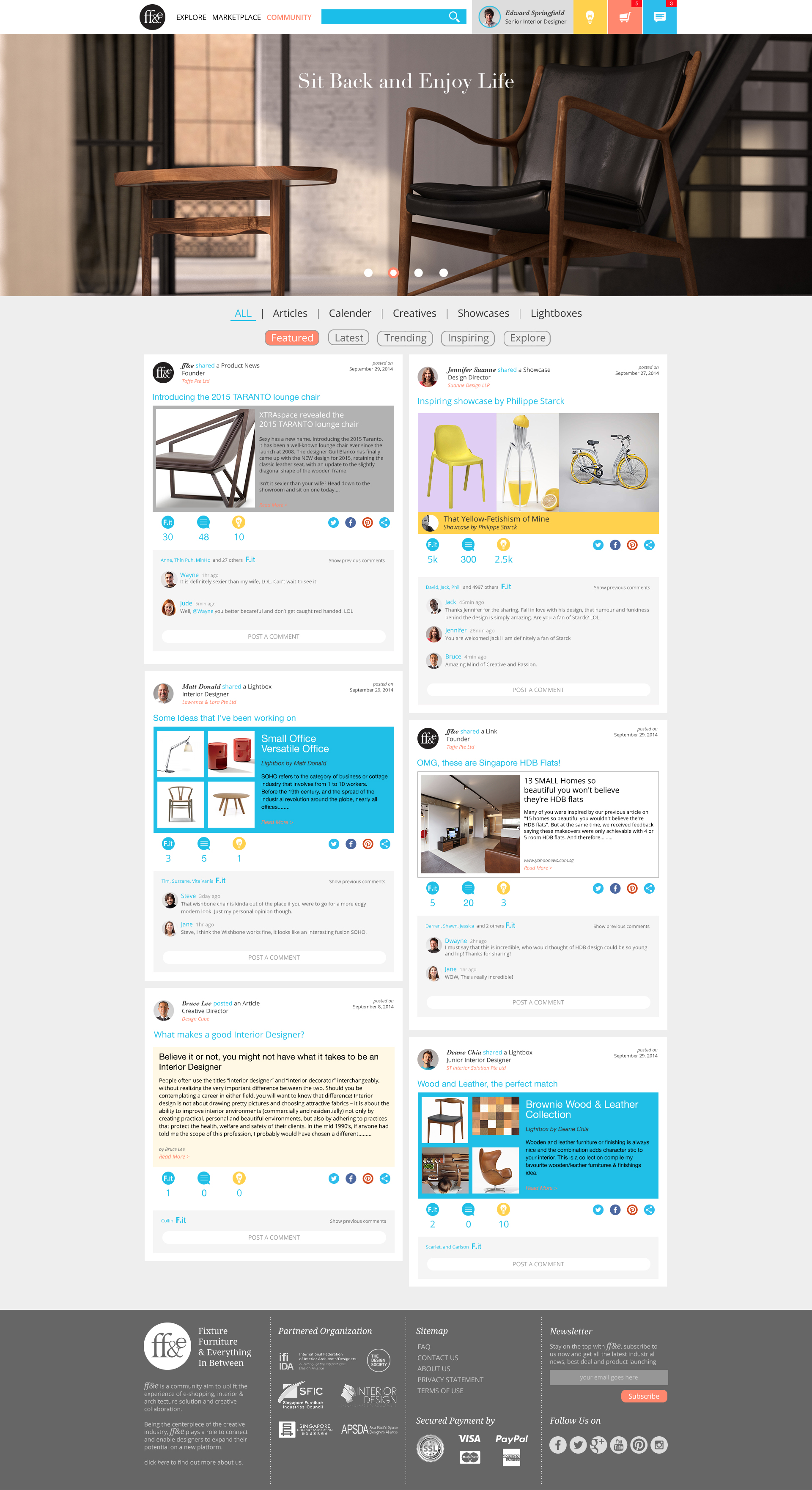
Brief
FF&E is a common term used in Interior Design, which refers to Furniture, Fixture, and Equipment.
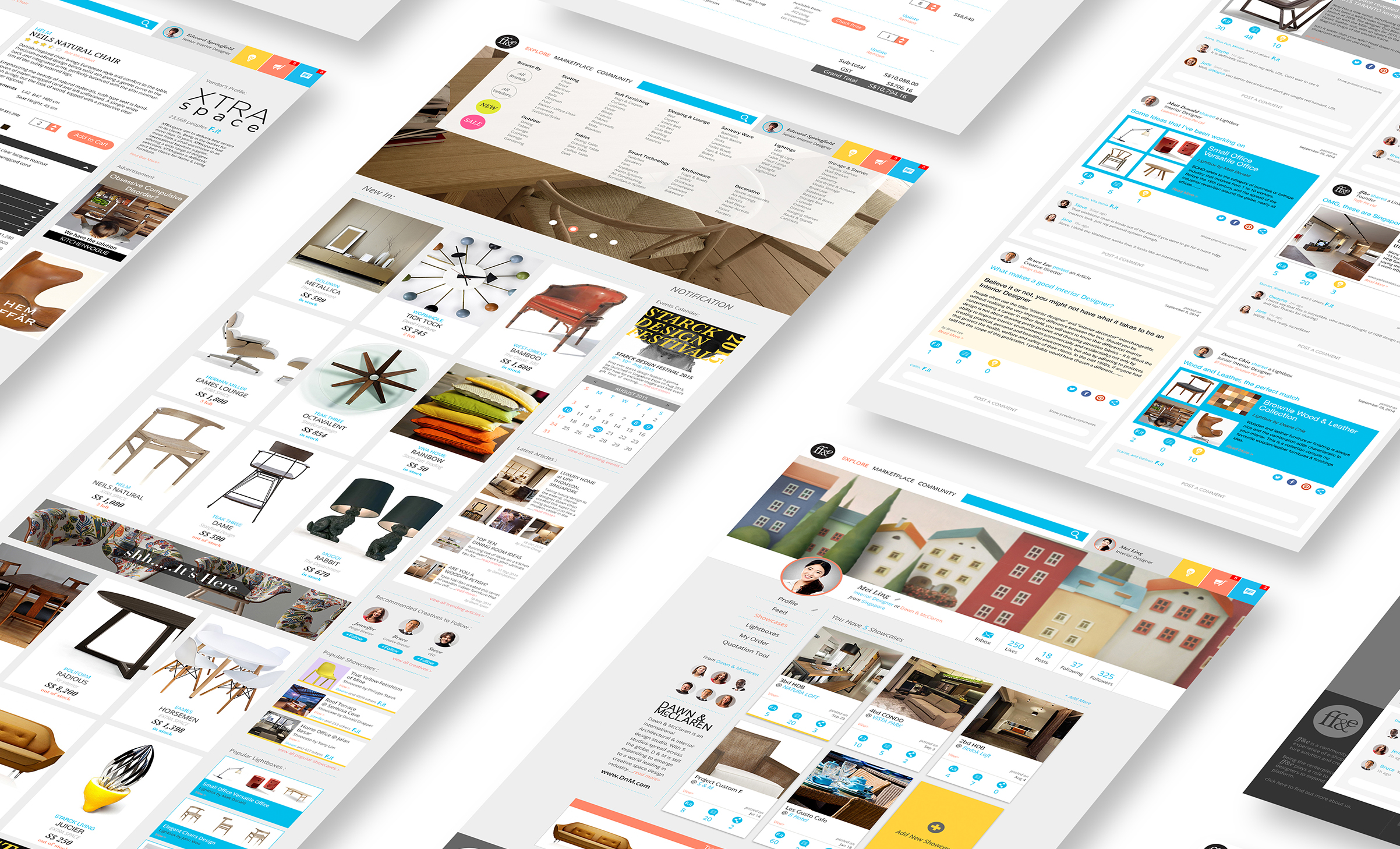
This is an internal project initiated by Six Planes, targeting to create an ultimate portal to connect designers, vendors, contractors, and users, all the need for FF&E from industrial scale to home make-over could be found in this portal.
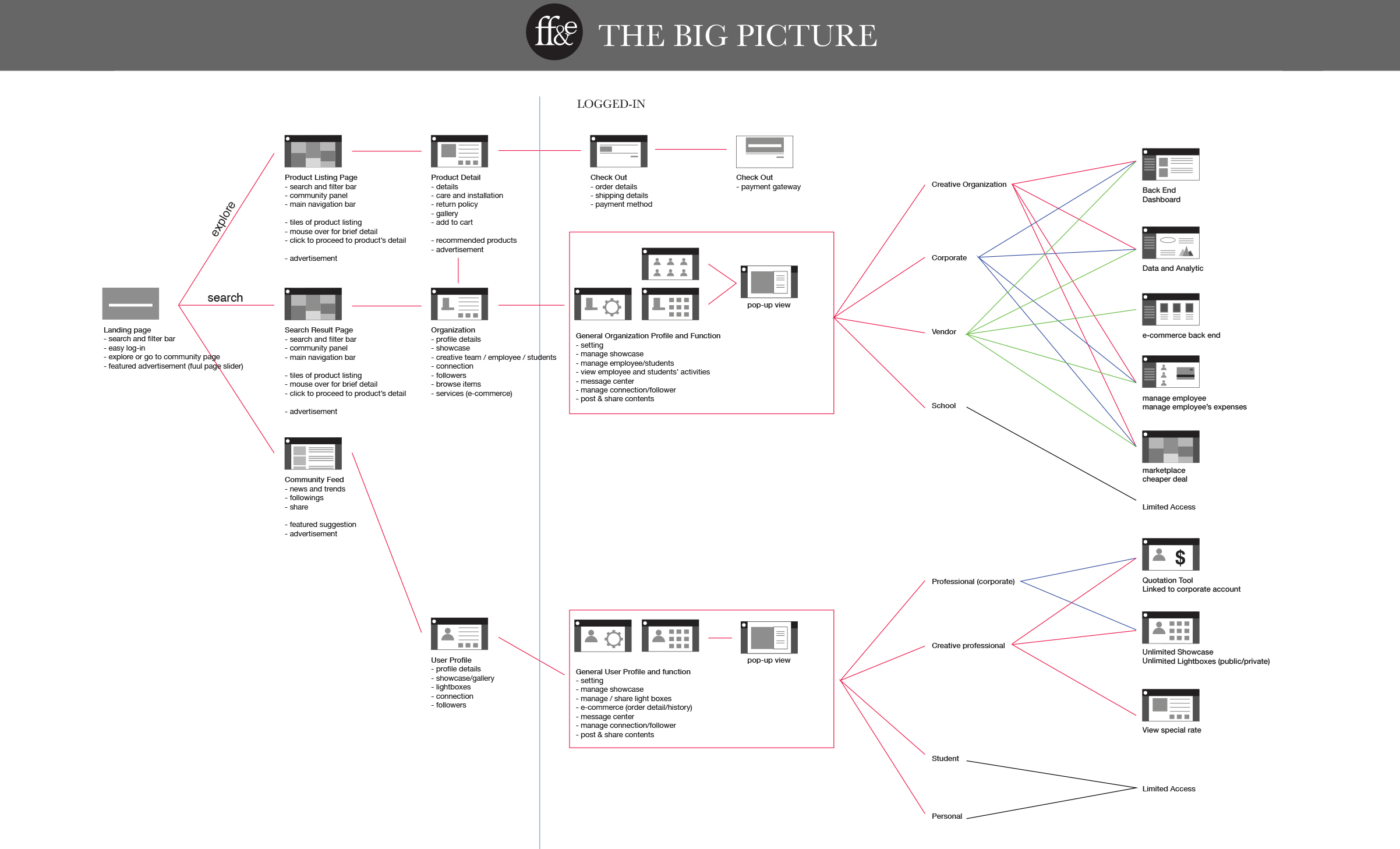
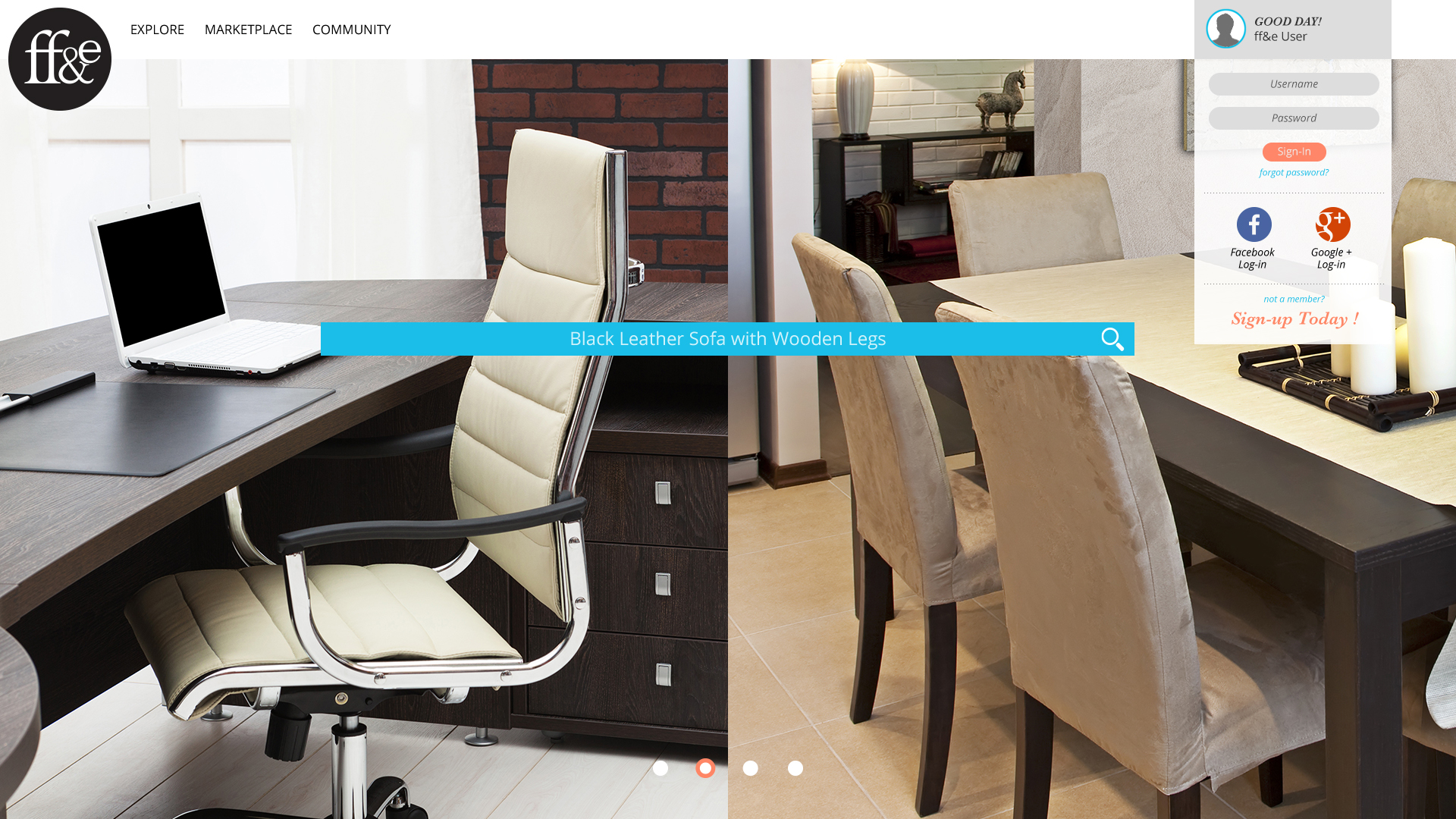
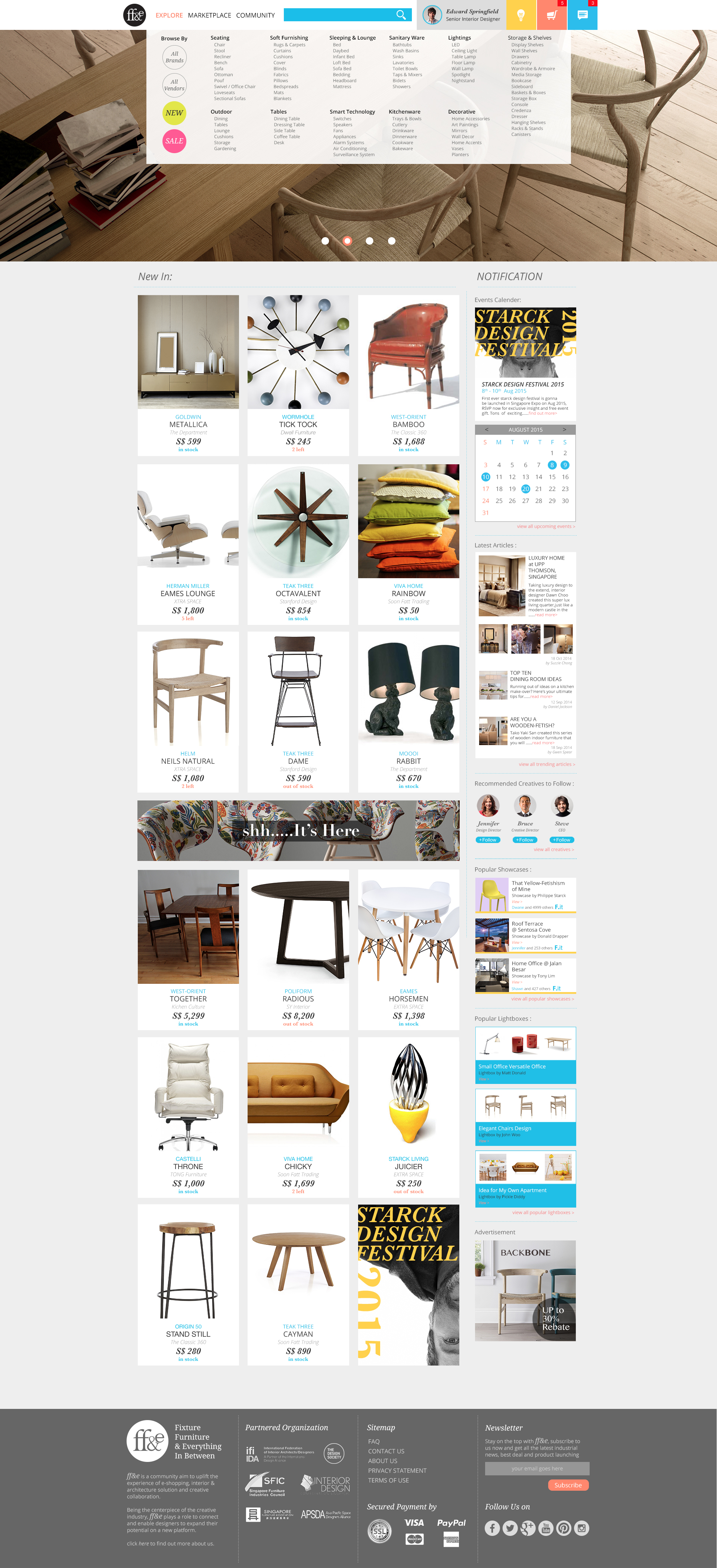
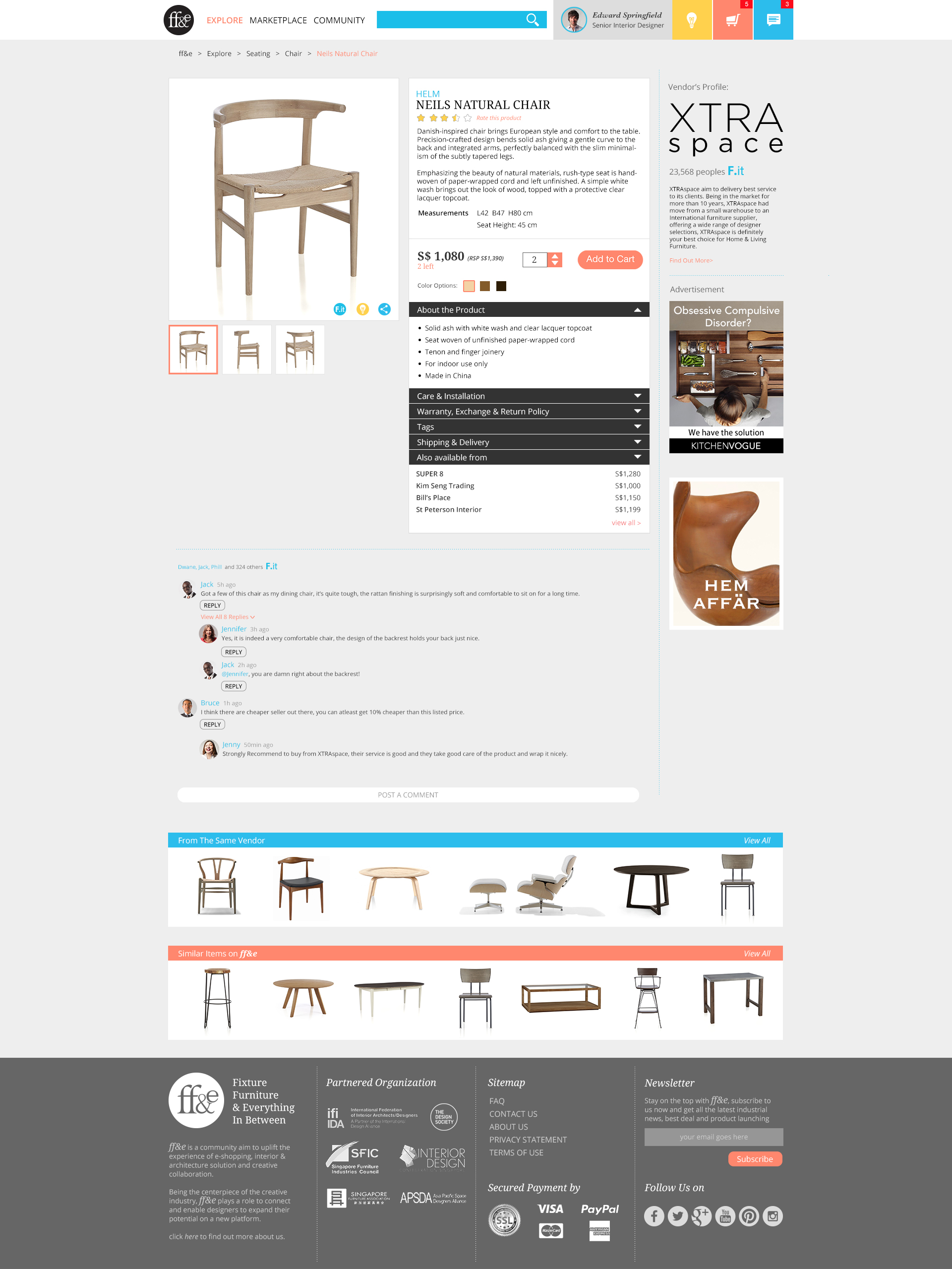
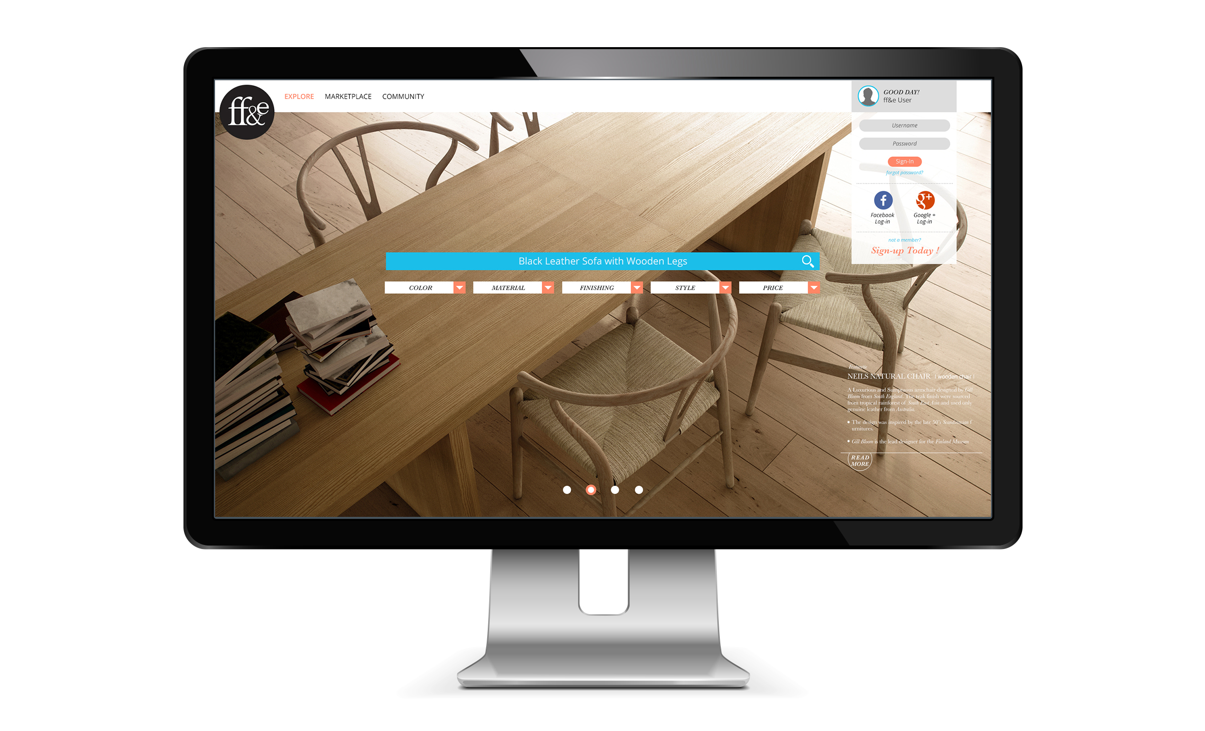
Our senior graphic designer, David Hillman was in charged of the branding of FF&E, while I focused on the web portal itself, from the base structure to a few key pages. These visuals were used to pitch to investors.
Earlier Development
FF&E scale was beyond any websites I’ve worked on, there were so many aspects to take into consideration.
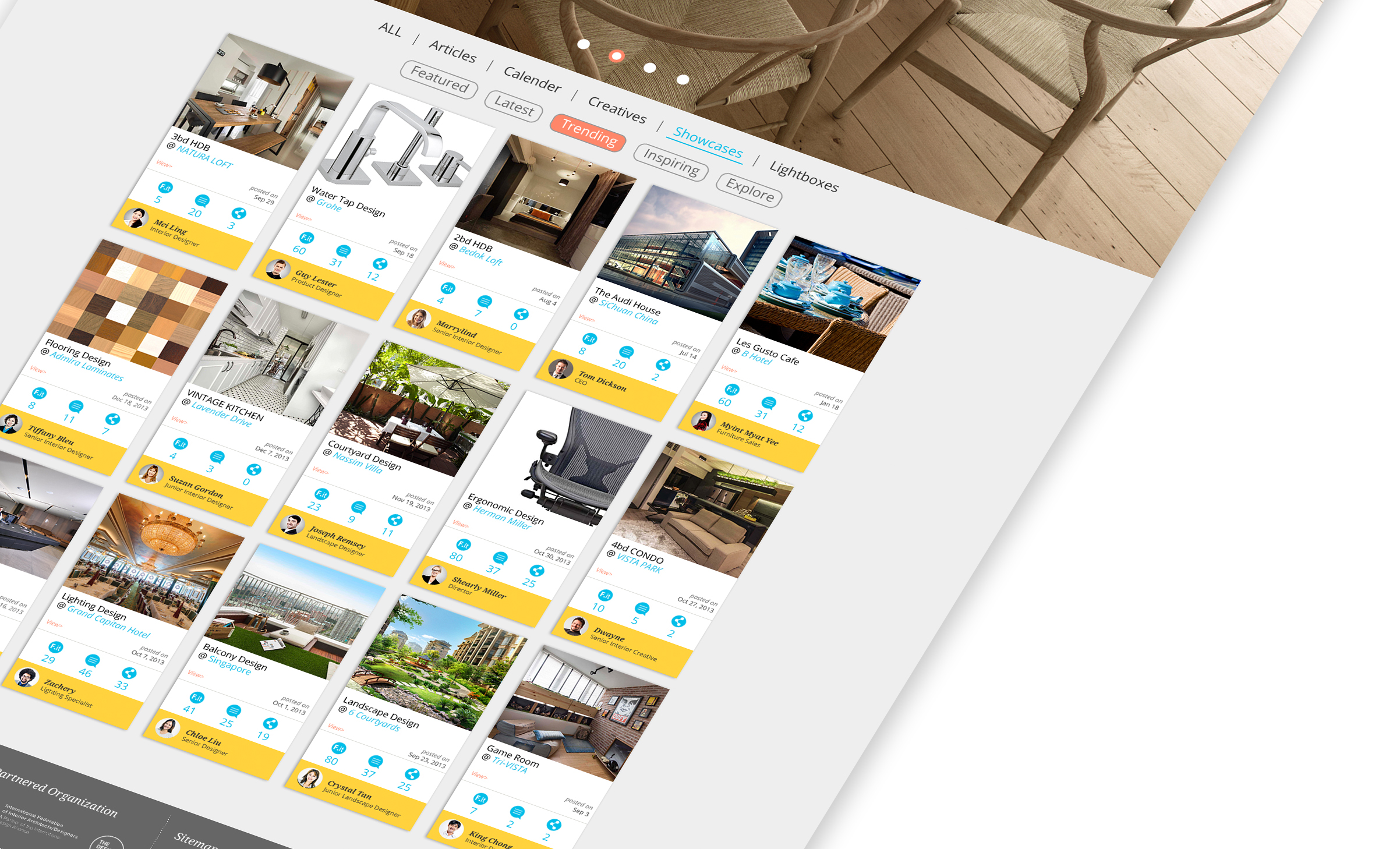
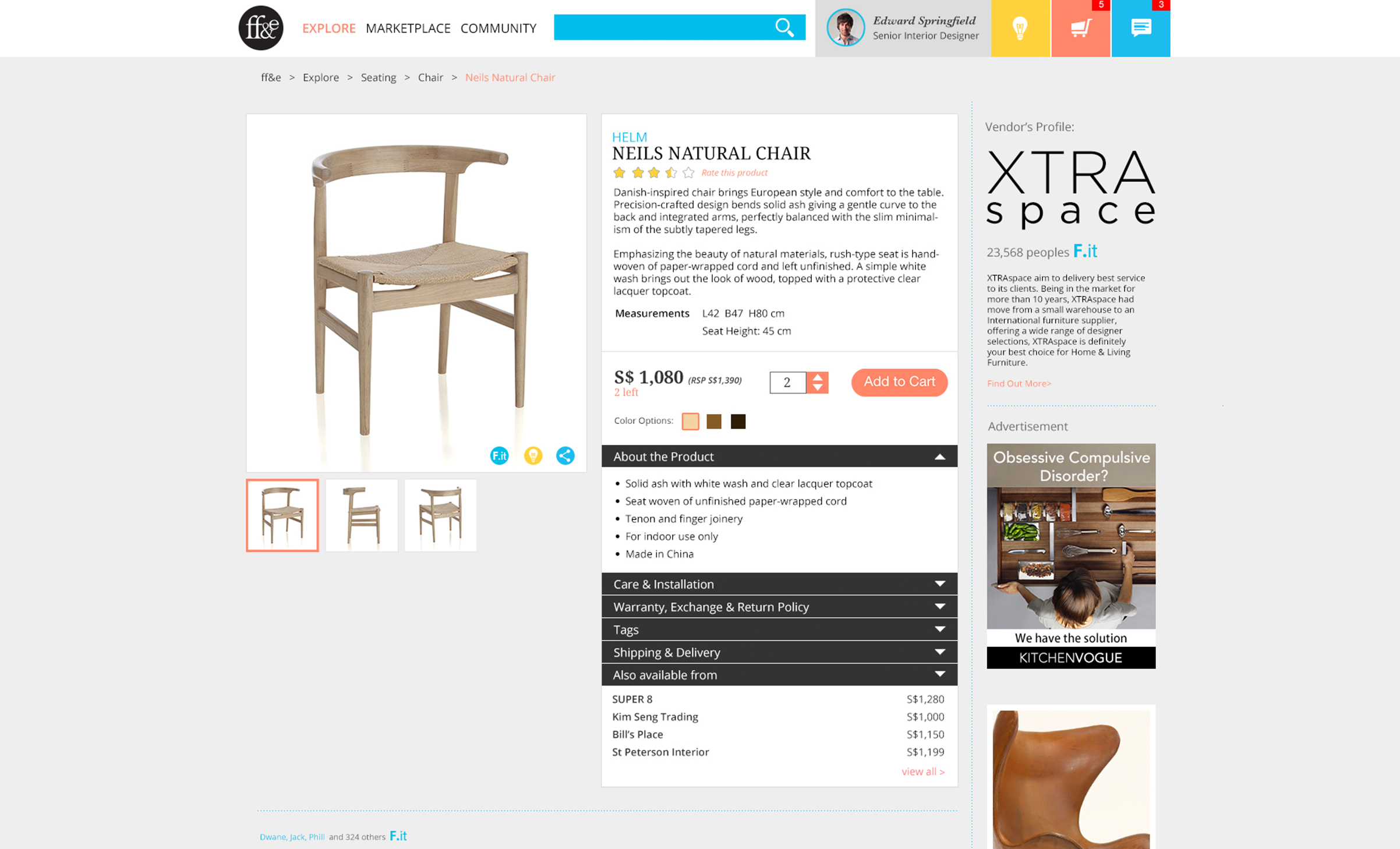
As this site is aiming at different users, we have to visualize various user journey to showcase the capability of the portal. To make the visual more compelling, I’ve put in a lot of effort in sourcing for images and creating contents instead of using dummy text or lorem ipsum.
Result


