Brief
Running down a long and dark tunnel, finally, you’ll find that light.
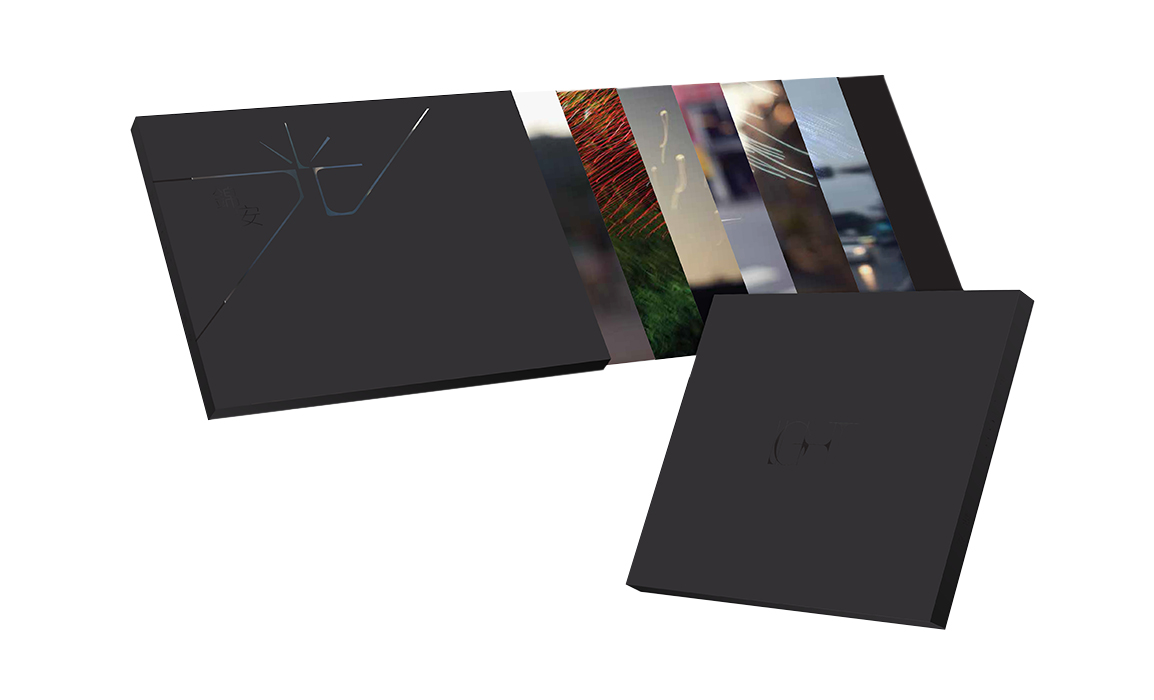
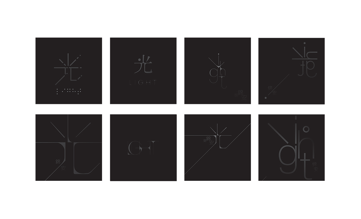
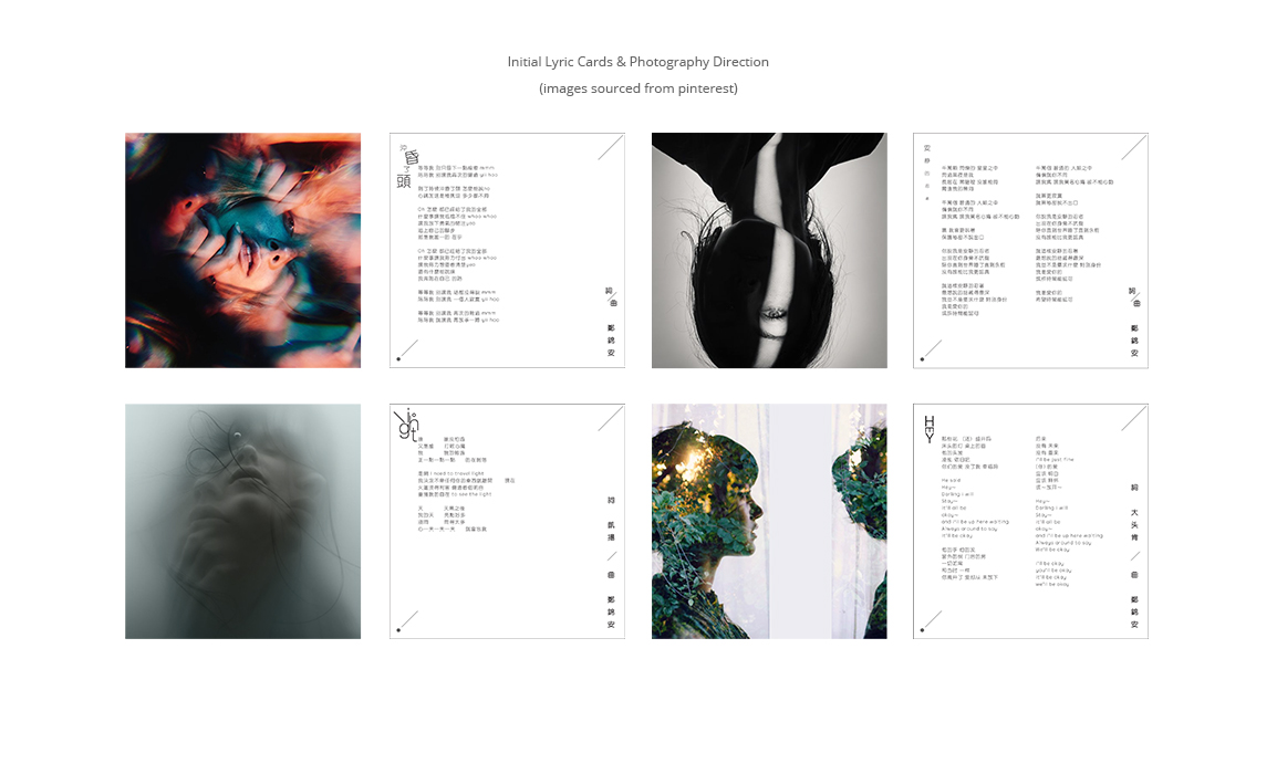
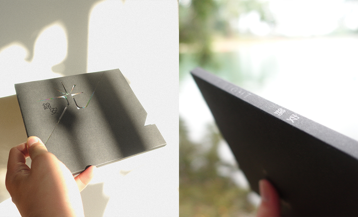
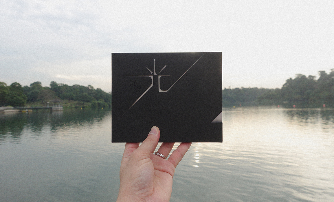
L I G H T represents hope, and a calling to be answered. L I G H T includes 5 songs written and performed by Jin An. As a growing local artist, she wants to tell stories through her songs. Below is the design progress of the album, starting from the album cover to the lyric cards. The album cover is a card holder with die-cut in Chinese character, which looks like a radiation of light. The lyric cards of different color is revealed through the die-cut. When the cards are being pulled out, there will be transition of contrast. There are some spot UV applied on the black cover as well, to suggest interaction with light.
Listen on Spotify and Apple Music.
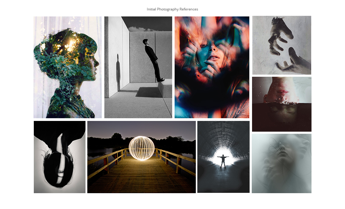
The photography direction of the album went along the idea of LIGHT, the method of light painting, multiple exposures, long exposure were used in the execution. Lavender Chang was in charged of the photography of the album, check out her page here : http://www.lavchang.com/
Process
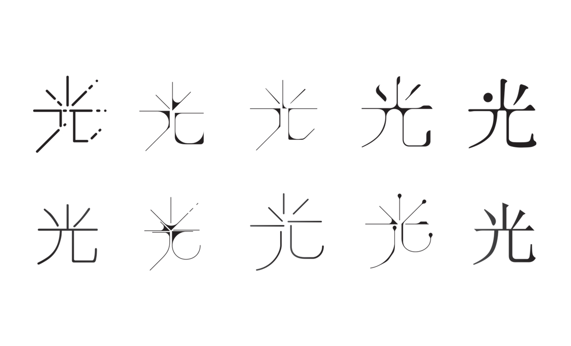
Chinese character has a form that represents its meaning, which is very fun to work with.
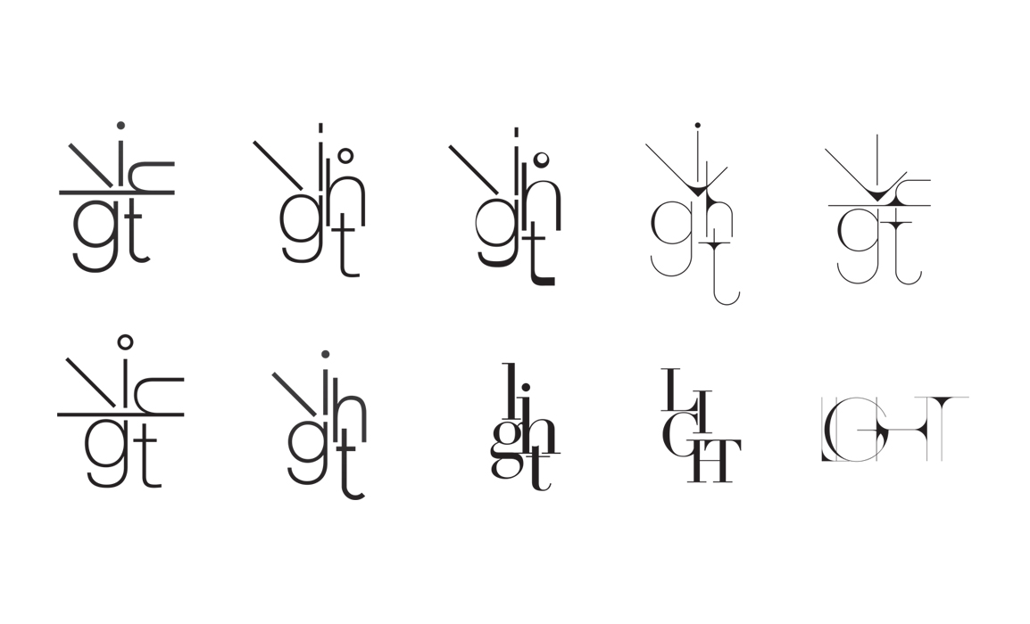
Below is the design progress of the album, you could see the progression from the design of the Chinese character used in the album cover to the lyrics cards design and initial photography direction. I’ve worked very closely with the artist and the producer to firm up the creative & art direction and to the final execution of the design and printing.
We’ve selected a local printer who have produced a lot of nice packaging for a famous local tea brand. In the final packaging, we’ve added a layer of PVC behind the slim die cut cover to secure it, which add some contrast to the matte surface and goes very well with the artist’s name in spot UV.


